You’ve spent a small fortune on ads, perfected your email sequences, and your social media game is on point. People are clicking. But then… nothing. Your conversion rate is flatter than a day-old soda.
If your traffic is high but your sales are low, your landing page is likely leaking revenue. In the world of digital marketing, you only have about 8 seconds to convince a visitor to stay. If your page is cluttered, slow, or confusing, they’re gone.
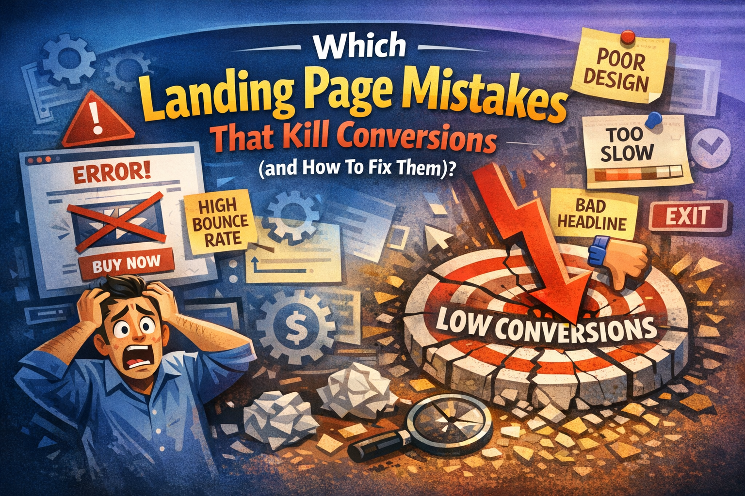
Here are the most common landing page mistakes that kill conversions and exactly how to fix them.
1. The “Kitchen Sink” Headline
Your headline is the first—and often the only—thing a visitor reads. When you try to cram every feature, benefit, and technical specification into one sentence, you create a “Kitchen Sink” headline. This clutter overwhelms the reader and dilutes your core value proposition. Instead of sparking interest, a crowded headline creates cognitive friction, forcing potential customers to work too hard to understand what you are actually offering them today.
The Mistake
Many businesses fall into the trap of being overly clever or excessively wordy. They use industry jargon that sounds impressive but explains nothing. By trying to appeal to everyone at once, the message becomes diluted. A vague headline fails to answer the visitor’s most urgent question: “What is in it for me?” Resulting in immediate bounces and lost revenue.
The Fix
The solution is radical clarity. Strip away the fluff and focus on one primary, transformative benefit. Use the “So What?” test to ensure your headline resonates emotionally and practically. Speak directly to the user’s pain point using simple language. A clear, punchy headline that promises a specific result will always outperform a complex one that tries to do everything.
2. A Call-to-Action (CTA) That Blends In
Your Call-to-Action is the finish line of your landing page, but many designers make it invisible. When a button matches the brand’s primary color palette too closely, it disappears into the background. A CTA that blends in fails to guide the user’s eye, leaving them unsure of how to proceed. Without a clear visual anchor, even the most interested visitors will likely slip away without converting.
The Mistake
The biggest error is choosing aesthetic harmony over functional visibility. Using “ghost buttons” with transparent backgrounds or low-contrast colors like grey on white makes the CTA feel optional. Furthermore, using generic text like “Submit” or “Process” creates “form fatigue.” It fails to remind the user of the value they receive, making the click feel like a chore rather than an exciting opportunity.
The Fix
To fix this, use a high-contrast “pop” color that isn’t used anywhere else on the page. Ensure the button is large enough to grab attention instantly. Complement the visual change with “power words” that emphasize the benefit. Instead of a boring “Register,” use “Start My Free Trial.” This reminds the user exactly what they gain by taking action right now.

3. Too Many Paths to Follow
A landing page is not a website; it is a dedicated destination for a single purpose. When you provide links to your “About Us” page, social media feeds, or blog posts, you are creating “leaks.” These multiple paths distract the visitor from the conversion goal. Every extra link is an exit ramp that leads your potential customer further away from the checkout or signup form you built.
The Mistake
Including a full navigation menu at the top of a landing page is a conversion killer. It gives users too many choices, leading to “Analysis Paralysis.” When faced with five different places to click, the easiest choice for a human brain is to click nothing at all. Distractions like footer links and sidebar widgets pull focus away from your singular, high-value offer.
The Fix
Adopt a strict “1:1 Attention Ratio.” There should be only one clickable goal on the entire page: your CTA. Remove the header navigation and the footer links entirely. By eliminating all exit points, you funnel the visitor’s focus toward the desired action. If they want to leave, the only logical way out should be converting or closing the tab entirely.
4. Ignoring the “Mobile-First” Reality
With the majority of global web traffic originating from mobile devices, a desktop-only mindset is a recipe for failure. A landing page that looks stunning on a 27-inch monitor often becomes a cramped, unclickable nightmare on a smartphone. If your page isn’t optimized for thumbs and small screens, you are essentially slamming the door on more than half of your potential audience and customers.
The Mistake
Common mobile errors include tiny font sizes that require zooming, oversized images that slow down load times, and buttons that are placed too close together. Many developers also forget that “hover” effects don’t exist on touchscreens. A layout that relies on complex mouse movements will break on mobile, frustrating users and causing them to abandon the page within seconds of landing.
The Fix
Design with a “Mobile-First” philosophy. Start by ensuring your page loads in under two seconds on a 4G connection. Use large, tappable buttons and maintain a vertical flow that is easy to scroll with one hand. Test your forms to ensure they are easy to fill out on a virtual keyboard, and keep your most important information “above the fold.”
5. Lack of Social Proof
Human beings are social creatures who look to others for cues on how to behave. If your landing page asks for money or personal information without showing that others have trusted you, it creates a “trust gap.” Without testimonials, reviews, or logos, your brand feels like a risky gamble. In the digital space, anonymity is the enemy of the conversion.
The Mistake
The mistake is assuming your product’s features are enough to close the deal. Many businesses hide their testimonials on a separate page or use “fake-looking” quotes without names or photos. A page devoid of real human feedback feels cold and corporate. If a visitor doesn’t see evidence of a satisfied community, their natural skepticism will prevent them from clicking “Buy.”
The Fix
Bridge the trust gap by placing social proof near your CTA buttons. Use real customer photos, video testimonials, or recognizable industry logos to build immediate credibility. Include specific data points, such as “Rated 4.8/5 by 2,000 users.” Authentic, verifiable proof lowers the perceived risk and gives the visitor the “social permission” they need to move forward with confidence.
Quick Comparison: Bad vs. Good Landing Pages
Feature |
Conversion Killer |
Conversion Winner |
| Headline | Vague & Flowery | Clear & Benefit-Driven |
| Navigation | Full Site Menu | No Menu (Hidden) |
| Images | Cheesy Stock Photos | Authentic Product/Human Shots |
| Form Length | 10+ Fields | 3–5 Essential Fields |
| Load Speed | 5+ Seconds | Under 2 Seconds |
Final Thoughts
Stop letting simple mistakes drain your marketing budget. By clarifying your headline, sharpening your CTA, and optimizing for mobile, you transform your landing page from a leaky bucket into a conversion machine. Focus on user experience and build trust—your bottom line will thank you.